Leonis Collection.
A hospitality house that needed to sound like a private address, not a hotel.
THE BRIEF
Leonis runs private hospitality across six Moroccan cities: chefs, drivers, housekeepers, therapists, the whole apparatus of a palace sent to a house you already own.
The service was never the problem. Every way of describing it came out sounding like a hotel, and a hotel advertises. This is the kind of place you hear about from somebody who has been.
- ROLE
- Identity, catalogue & art direction
- ENGAGEMENT
- Freelance · Direct client
A hotel advertises.A house is introduced.
THE DECISION · THE CATALOGUE
Twelve pages that never ask for the sale.
The catalogue is the brand here. Everything else is a reminder that it exists.
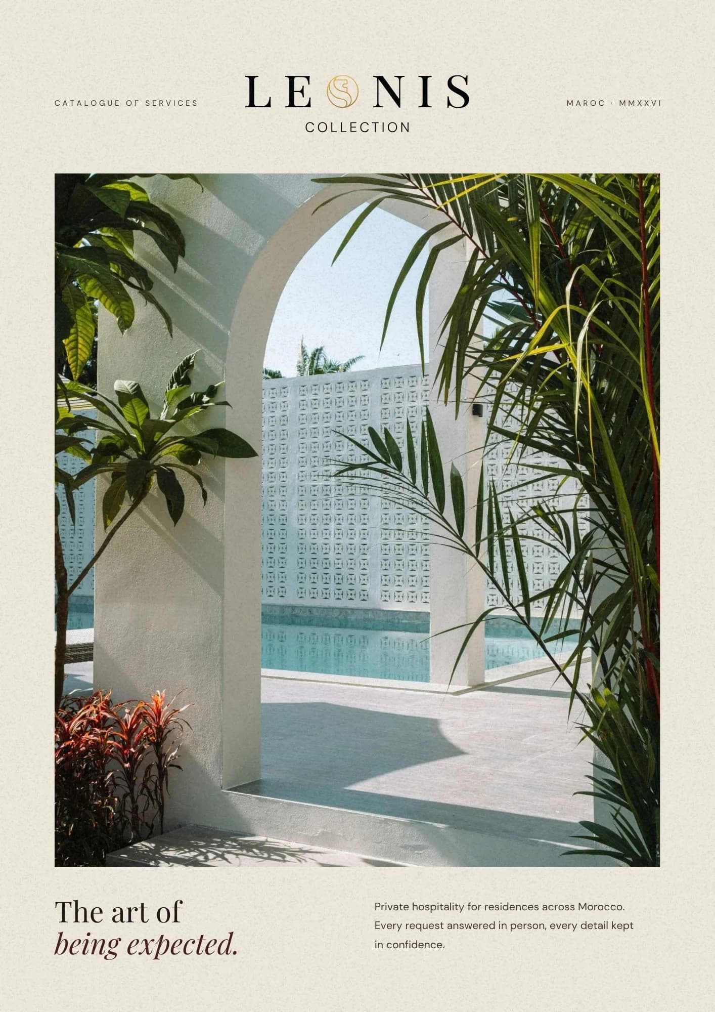
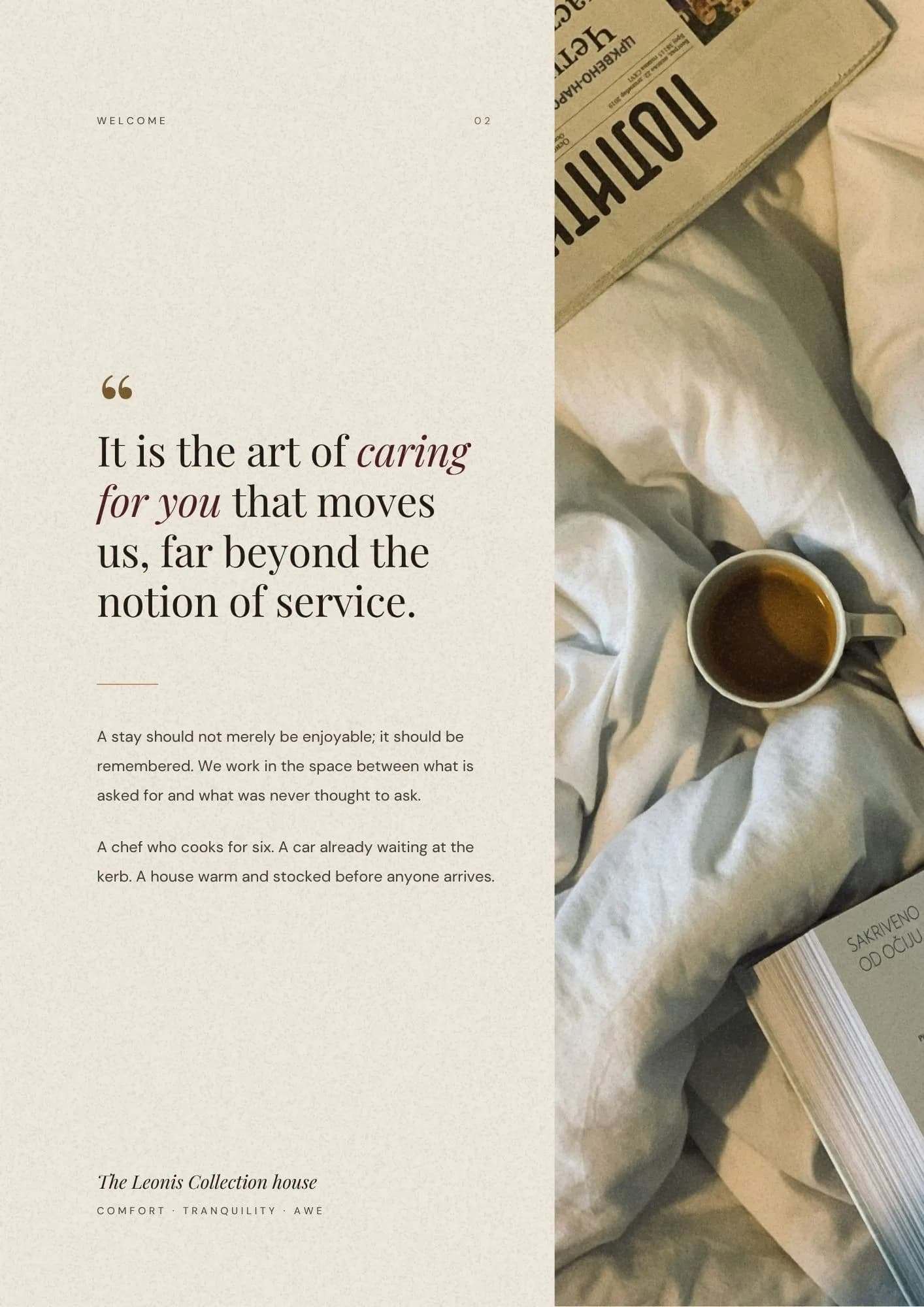
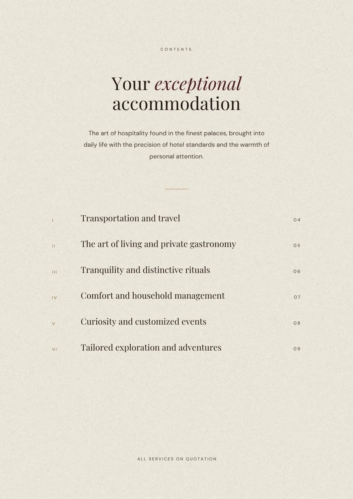
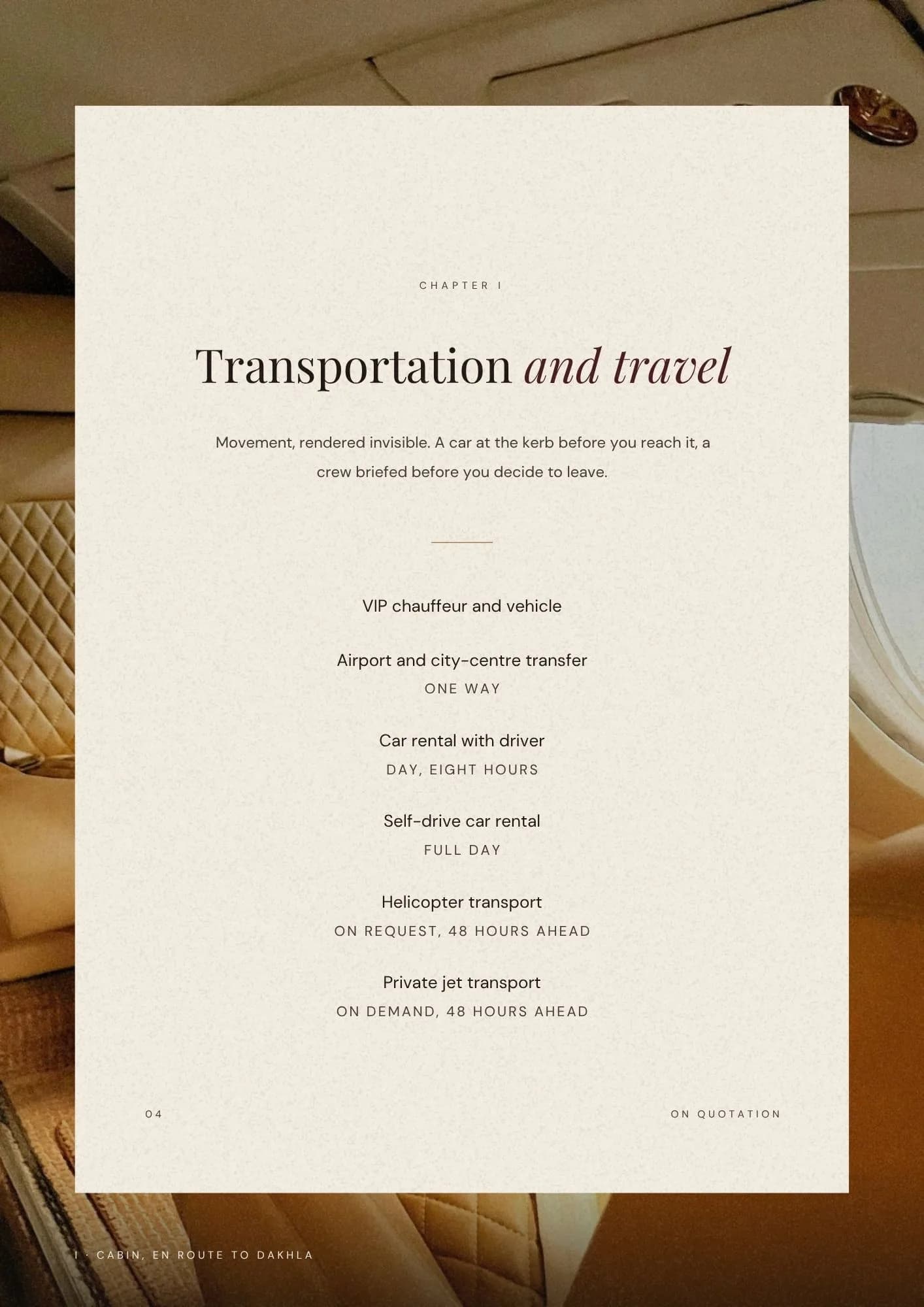
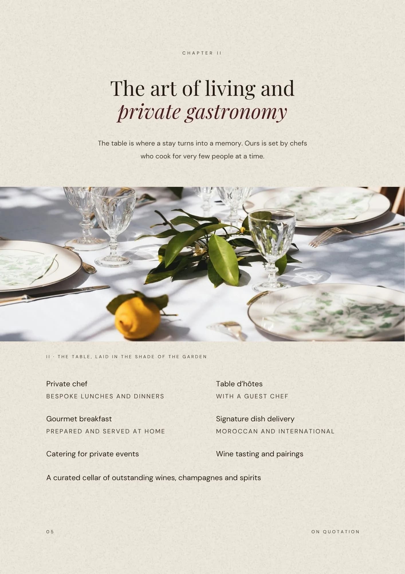
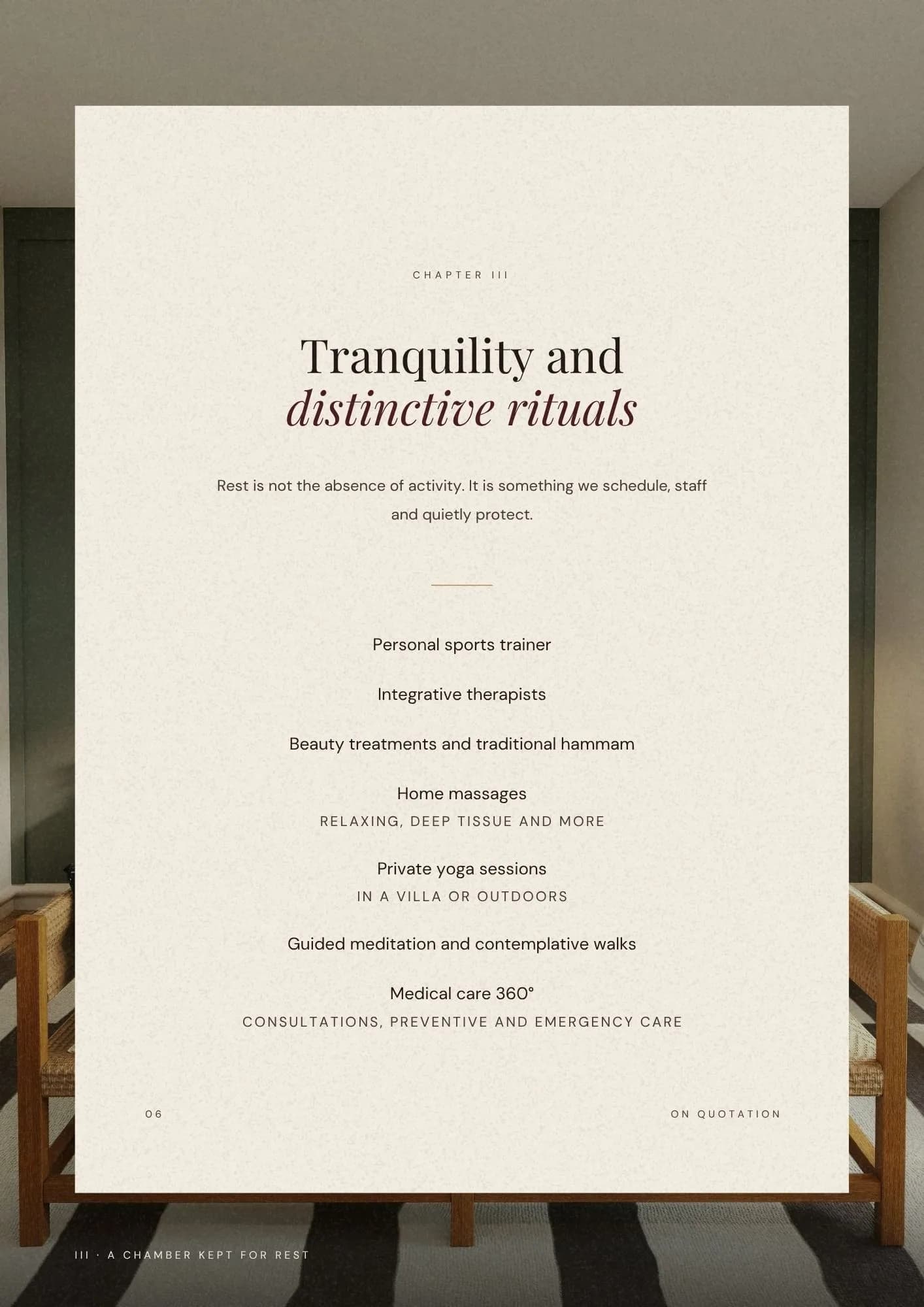
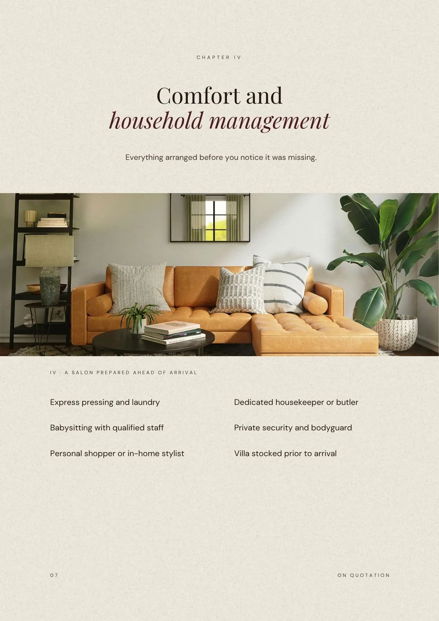
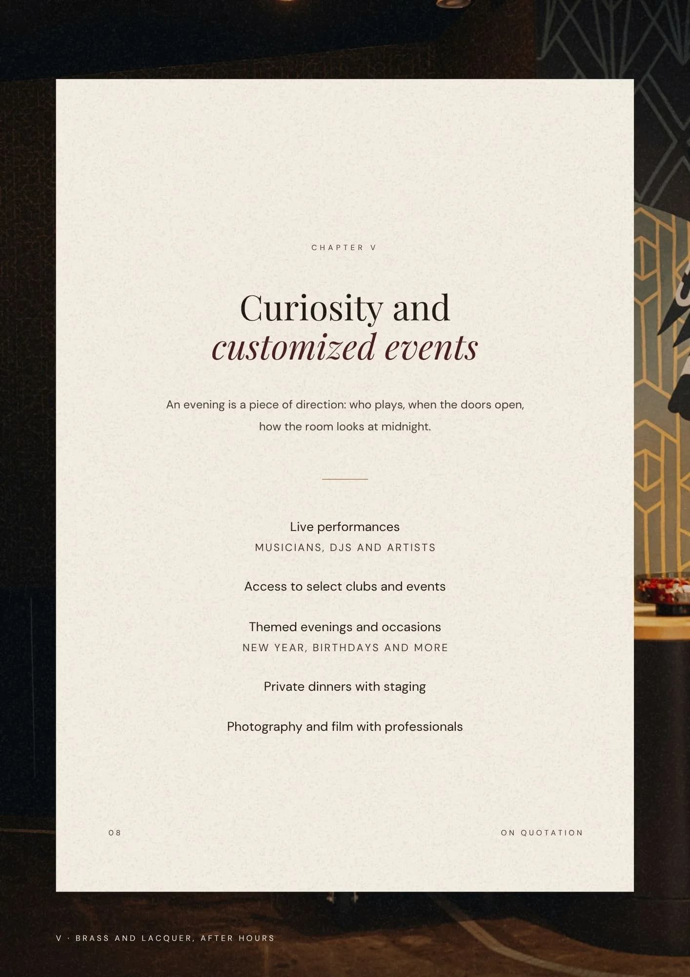
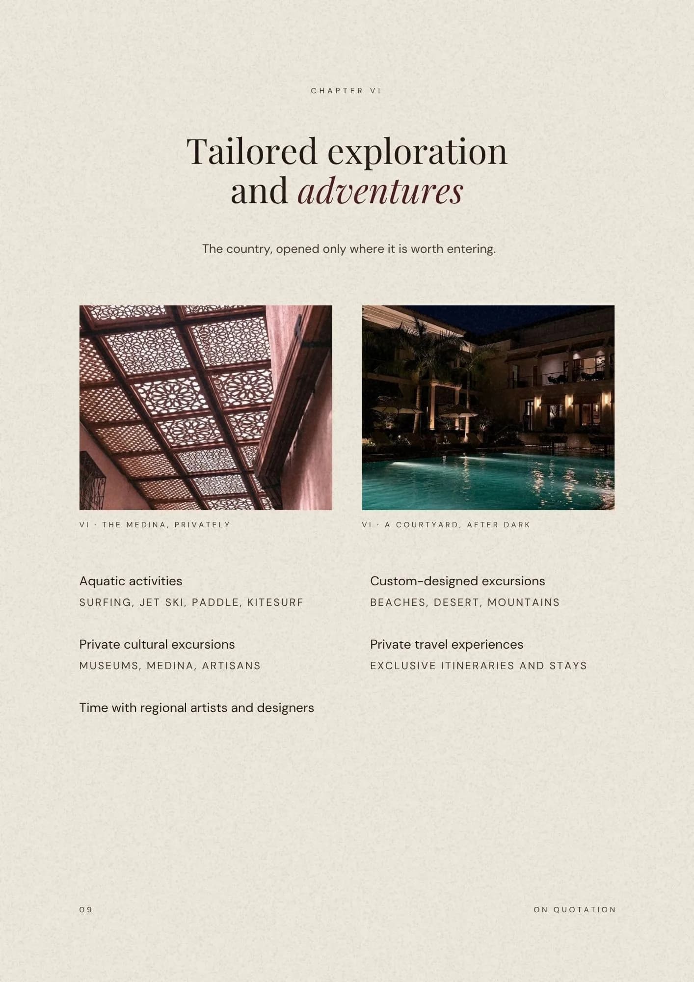
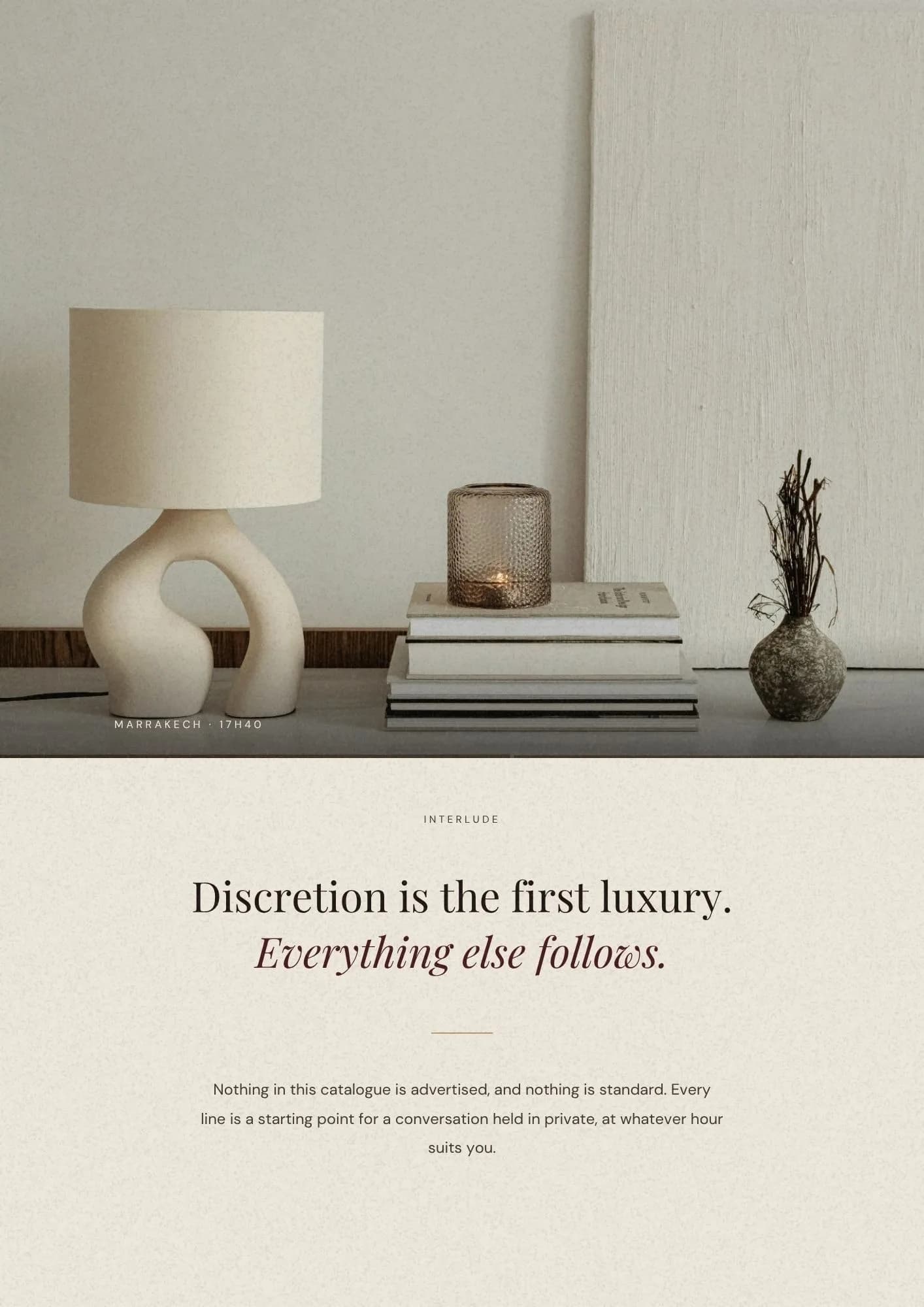
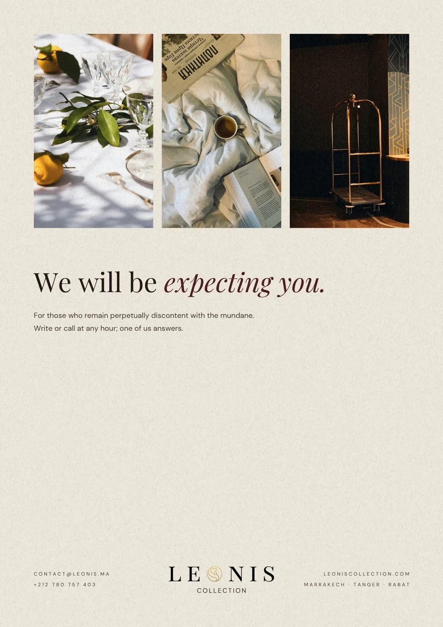
Six chapters: transport, the table, rituals, the household, events, exploration. Each opens on a full-bleed photograph and closes on a short list. There are no prices. Every line reads ON QUOTATION, because a printed number invites a comparison and this is not a comparison.
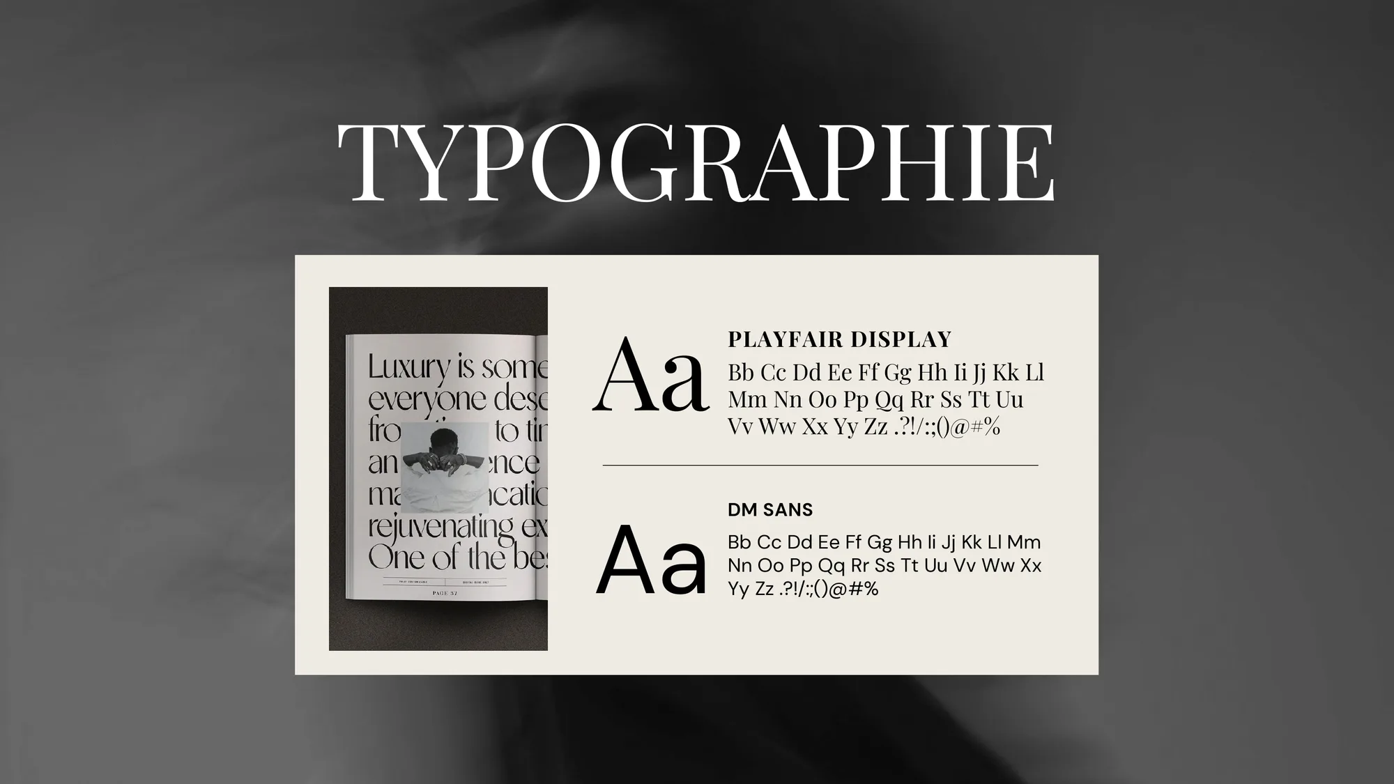
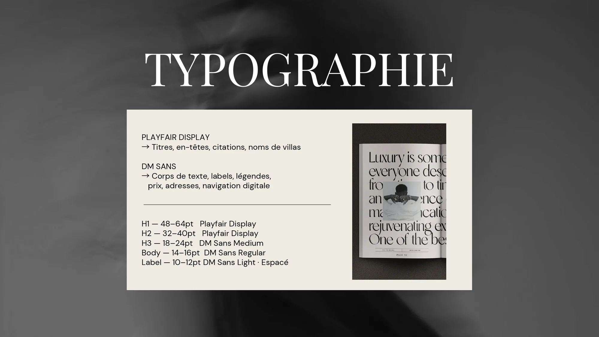
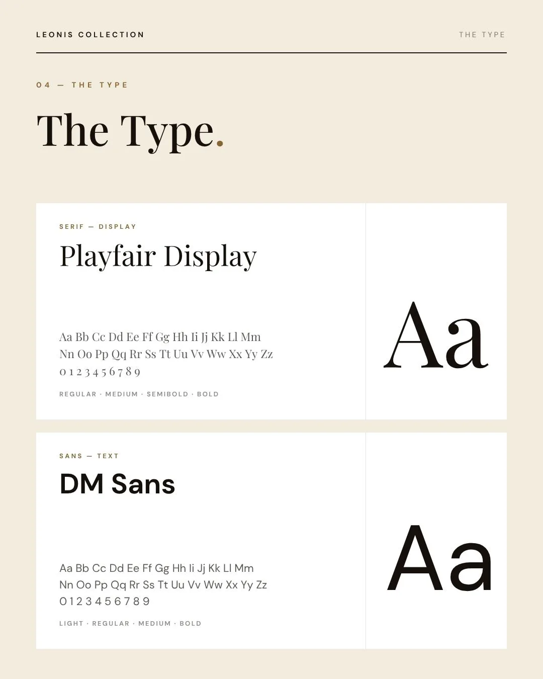
The type carries the restraint. Playfair Display takes the chapter titles, with the italic on the second half of each phrase so every heading lands on a soft syllable. DM Sans handles the service lines at a size that assumes good light and no hurry.
THE DECISION · THE MARK
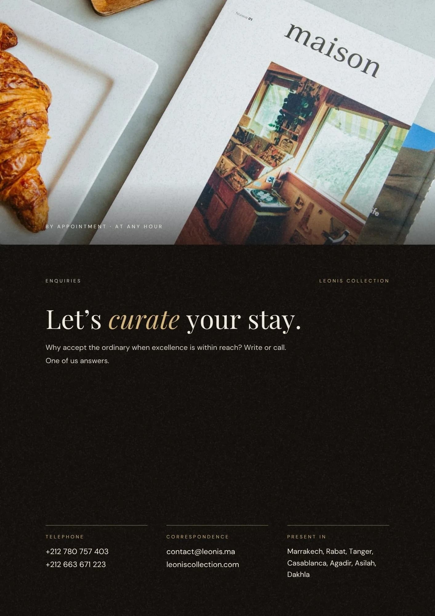
A lion, drawn without lifting the pen.
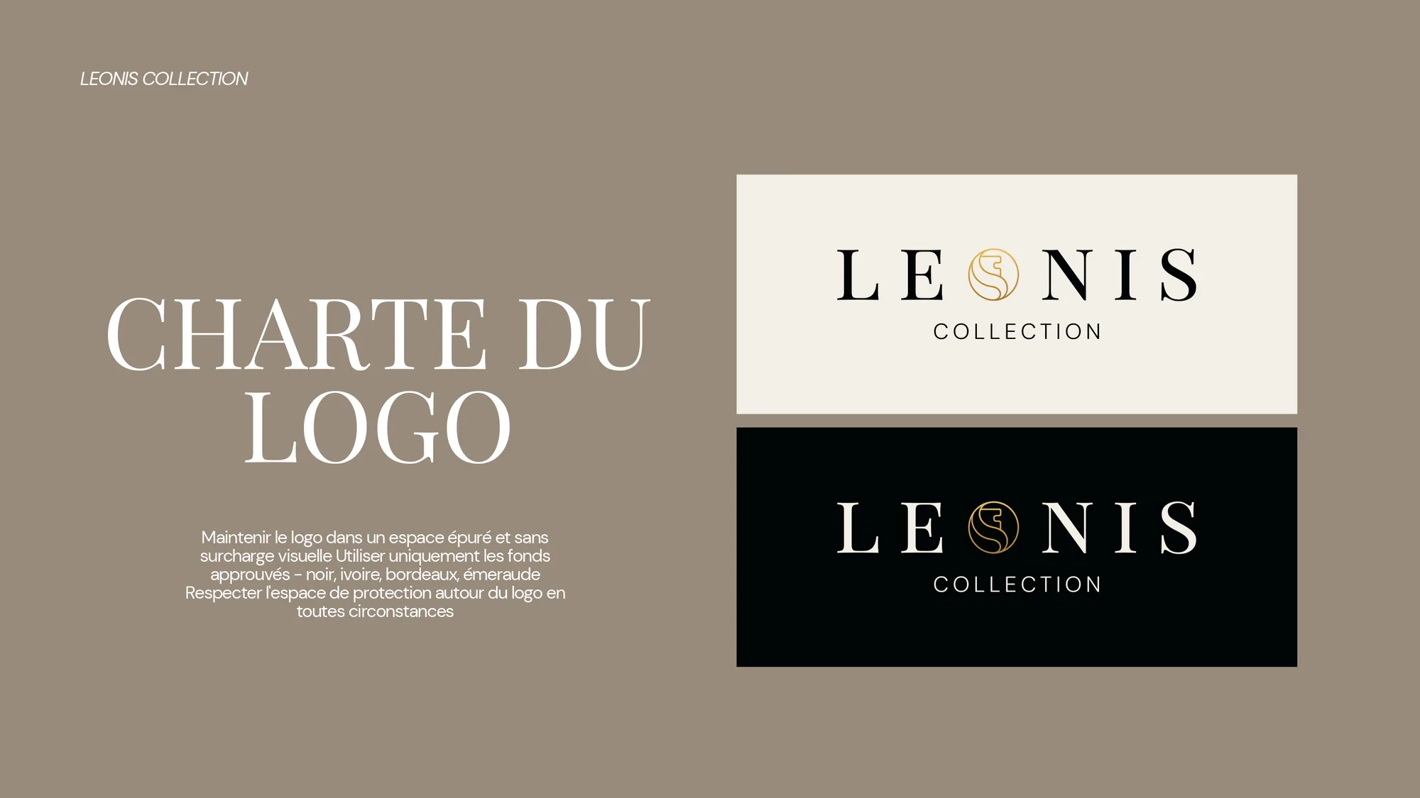
From the Latin leonis, of the lion. One unbroken line closed into a circle, set between the E and the N so the wordmark has to be read slowly. A mark that takes a second longer to read is a mark that gets looked at.
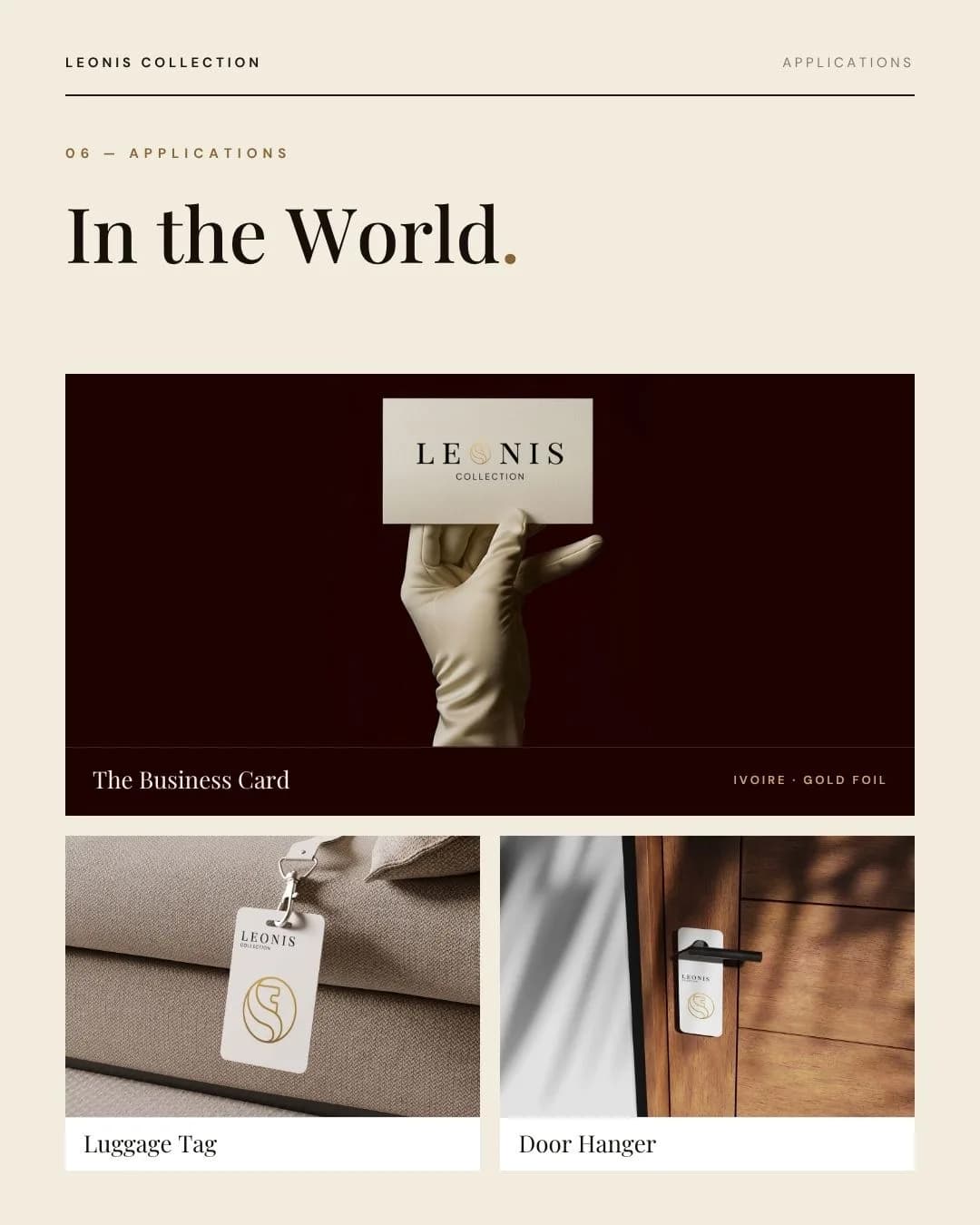
Specified as gold foil on ivory, with a blind deboss wherever the surface is already doing the talking. Shown here as mockups: the identity was delivered as files, ready for production.

THE SYSTEM
A guide they can run without me.
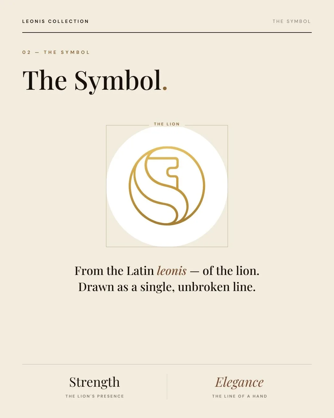
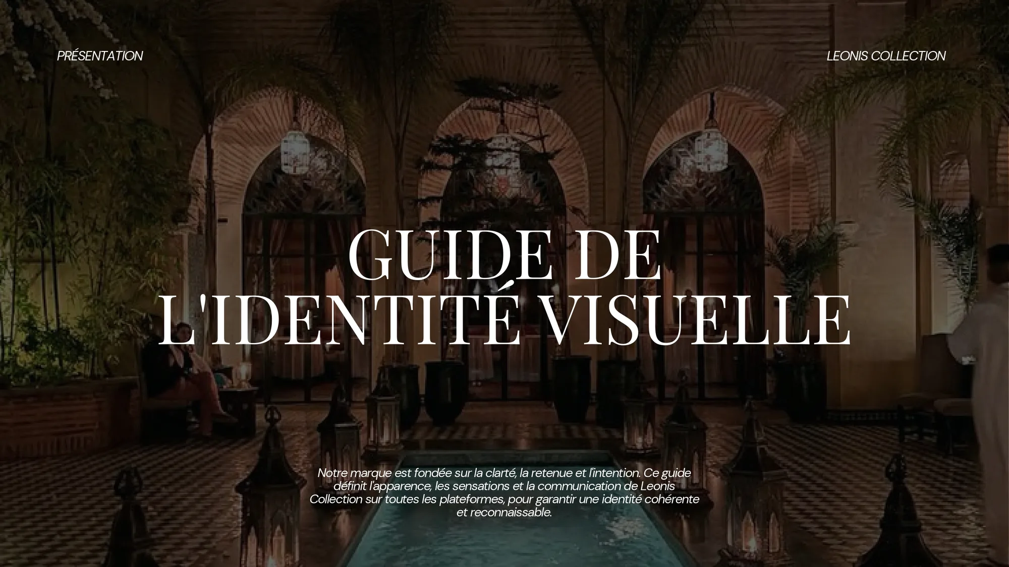
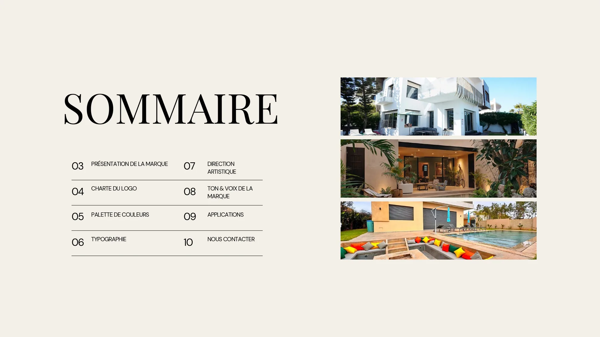
Twelve pages in French, because French is what the team works in. A logo charter with clear-space and the four approved grounds. Playfair Display and DM Sans, with the scale fixed from H1 down to the spaced label.
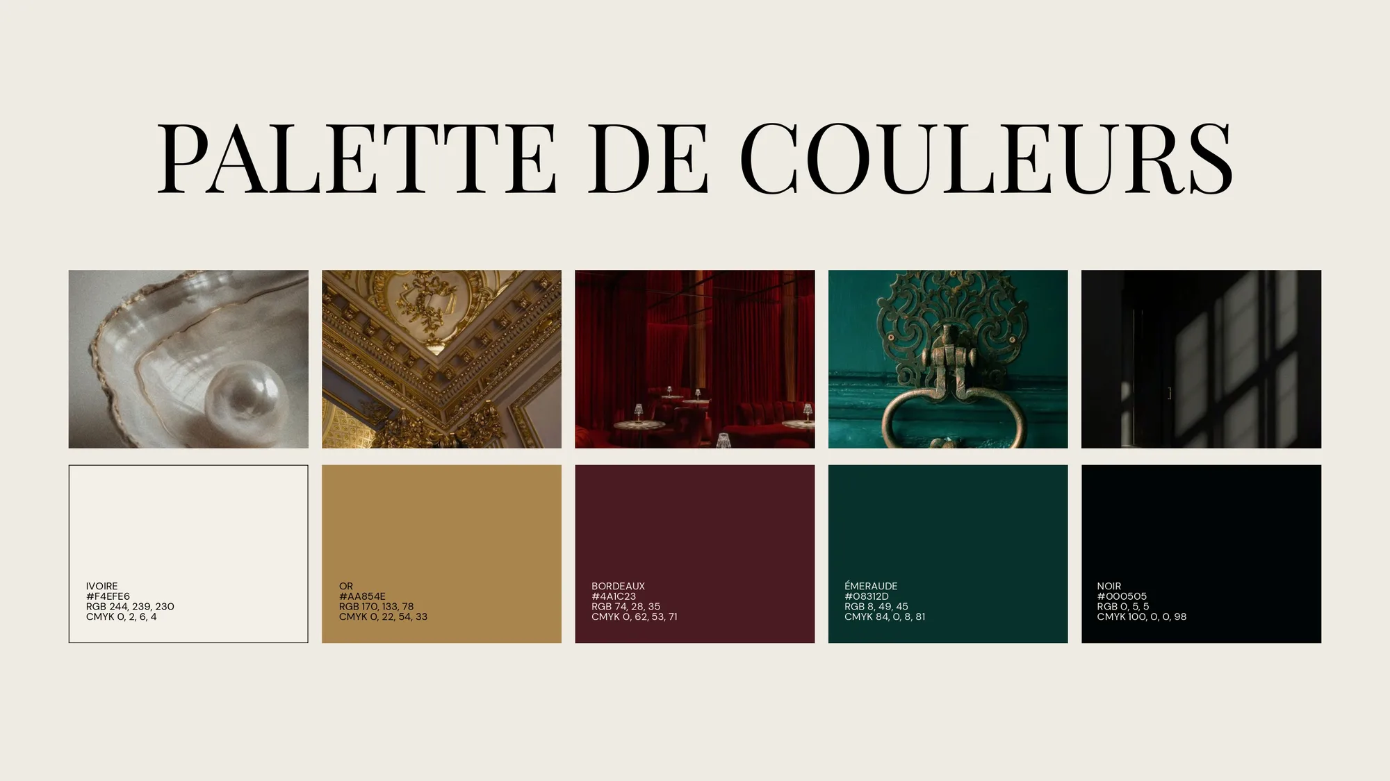
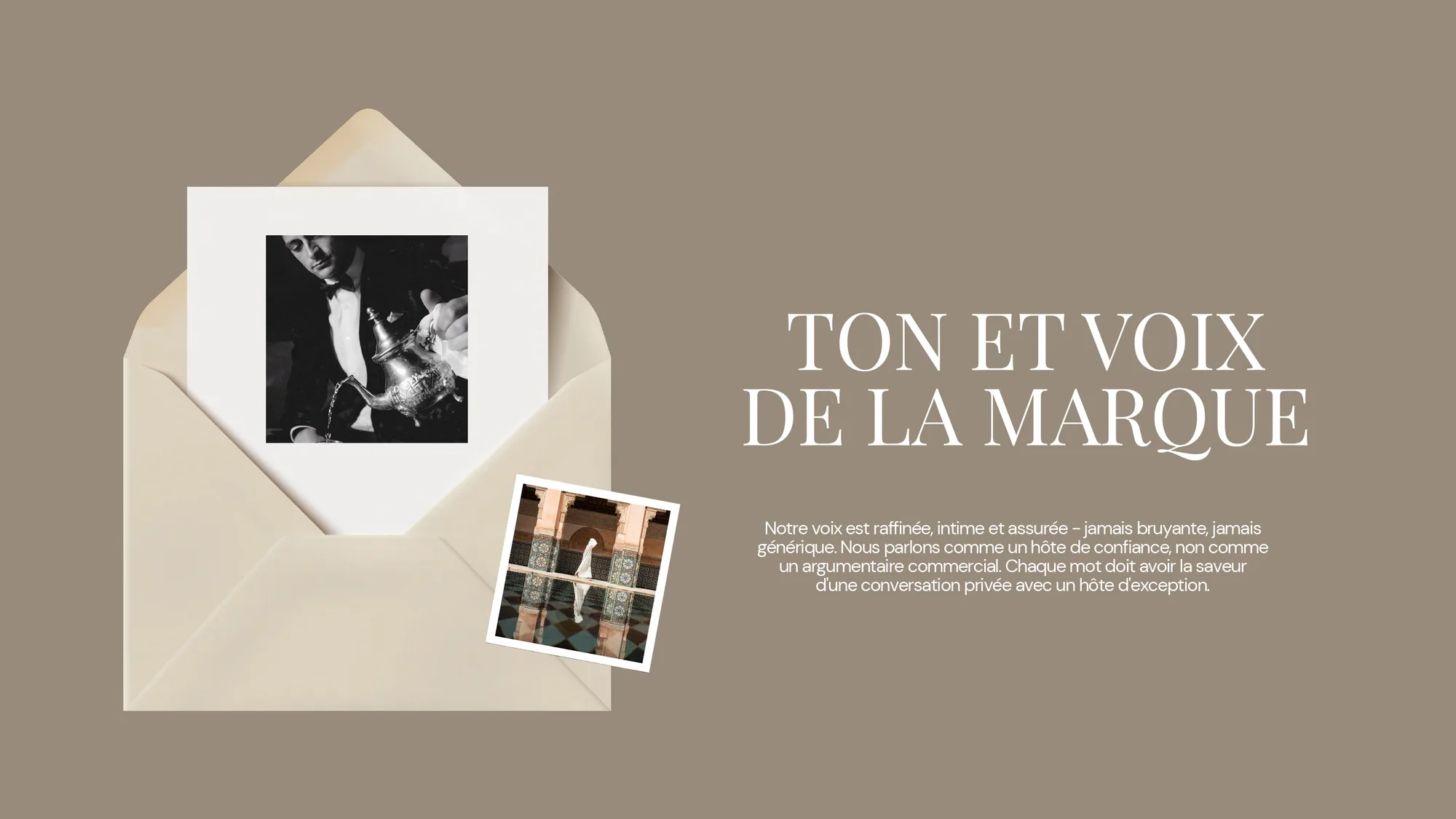
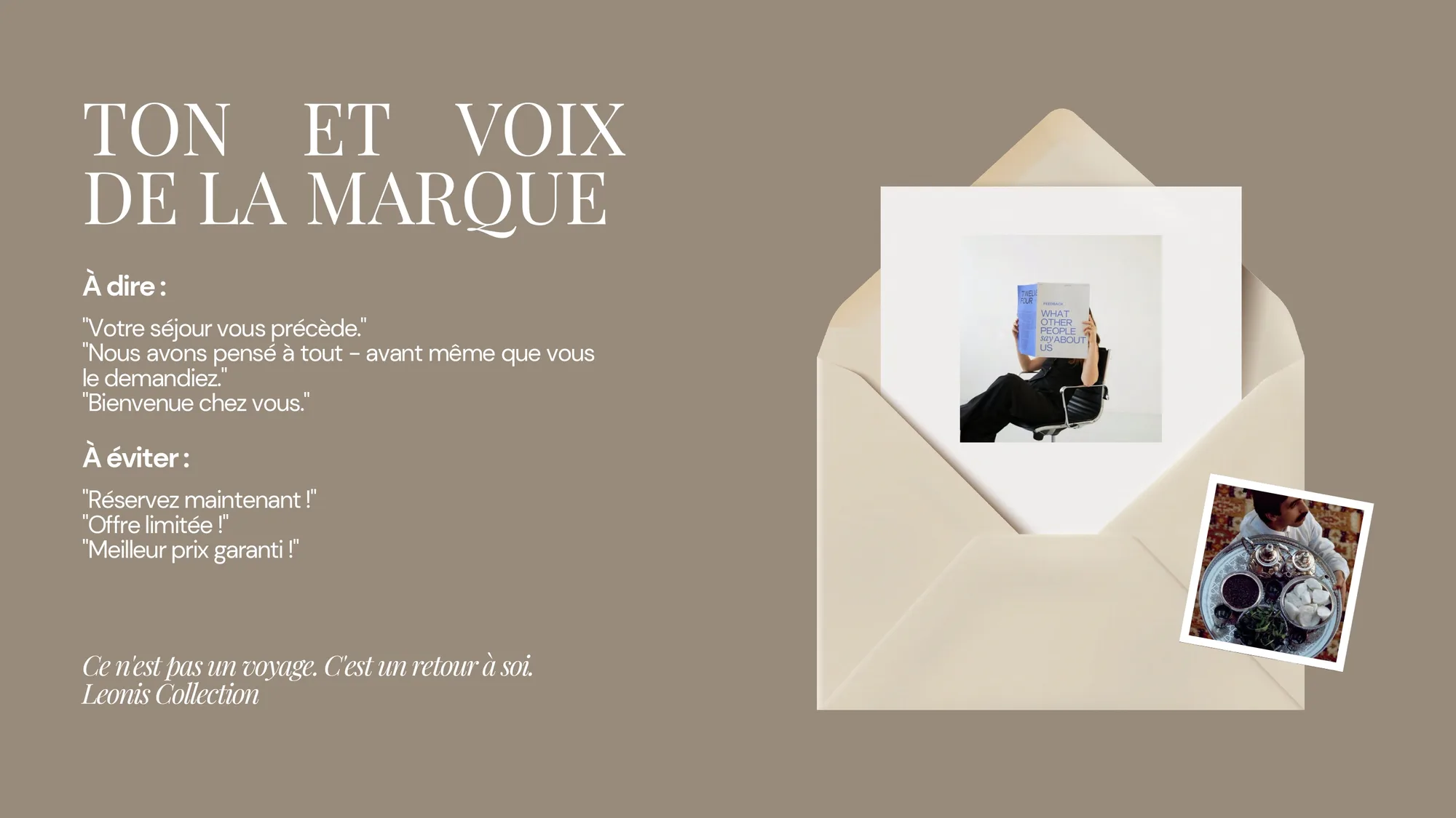
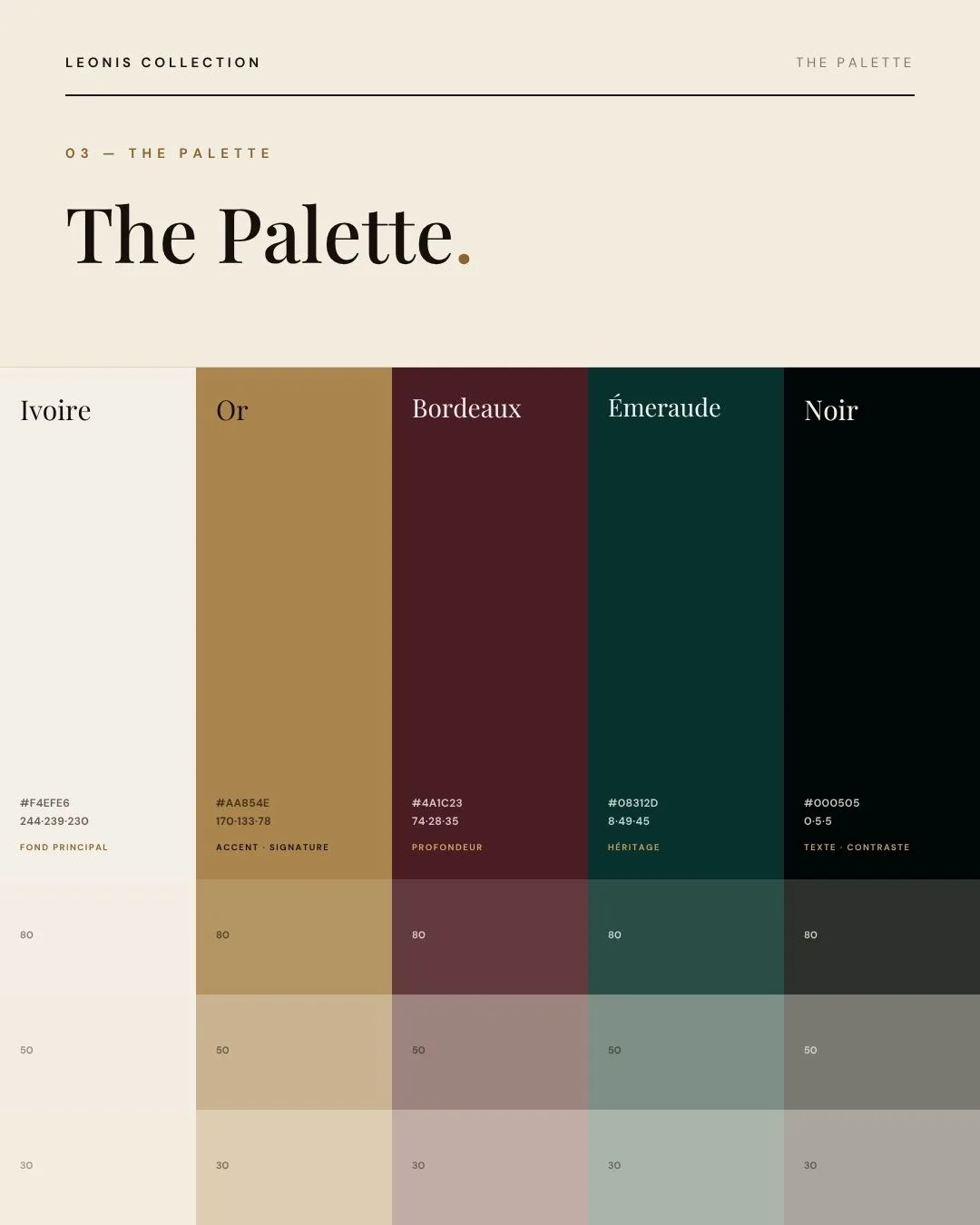
Five colours, named and ranked: Ivoire, Or, Bordeaux, Émeraude, Noir. Then the page most guides skip: tone of voice, with the sentences to use and the ones to retire. Book now went on page ten and has not been seen since.
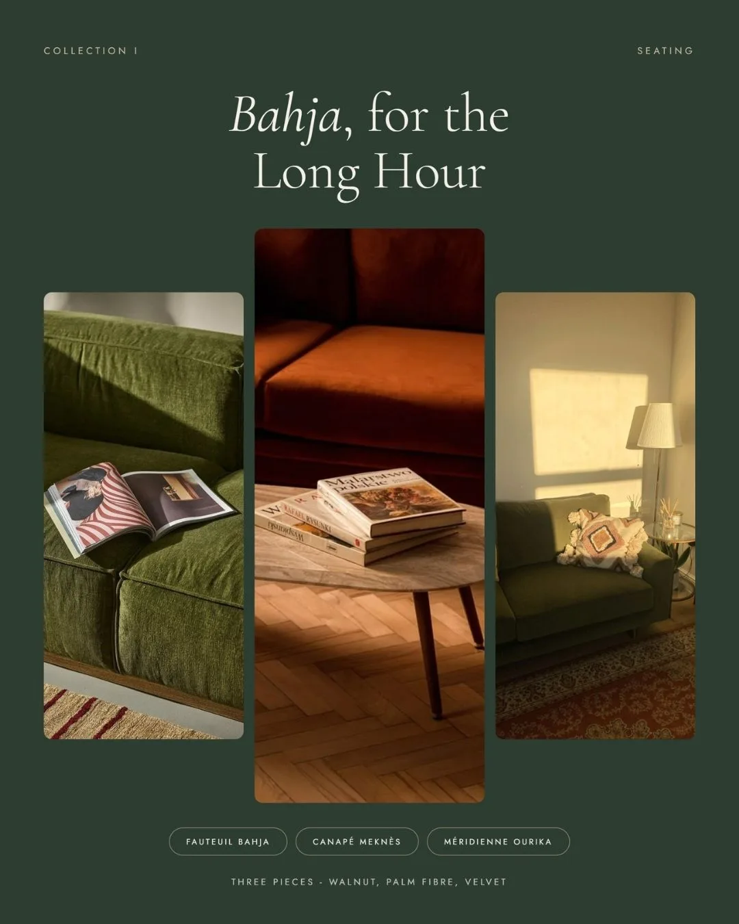
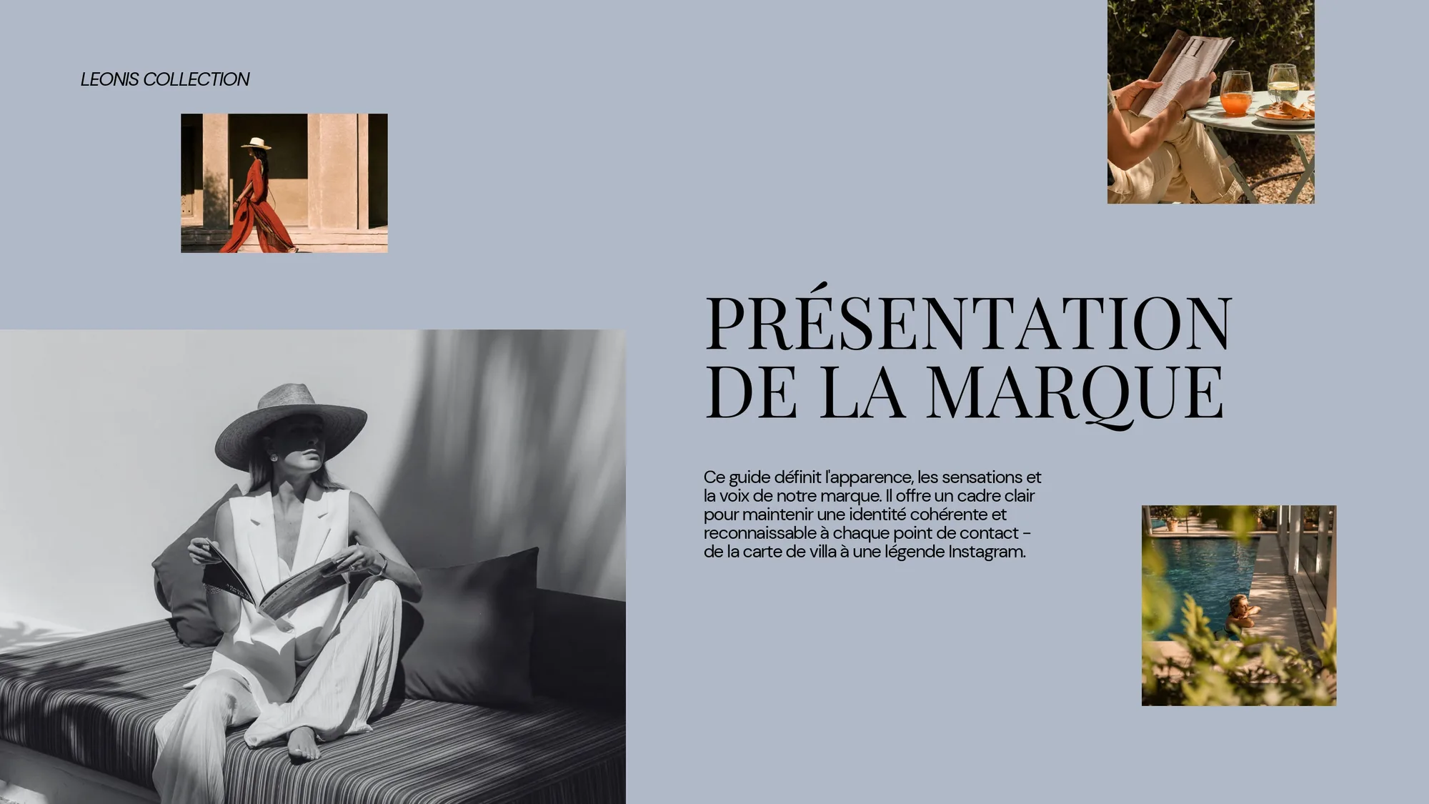
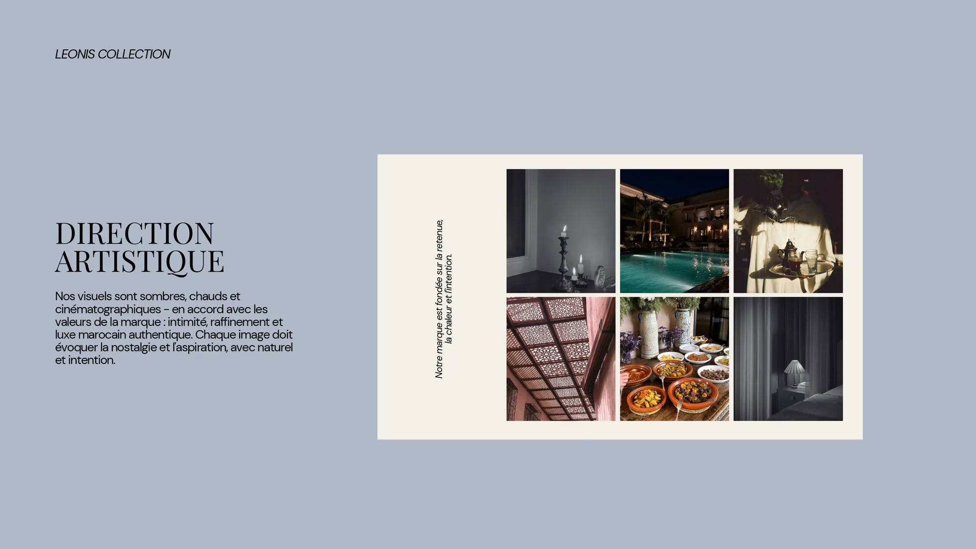
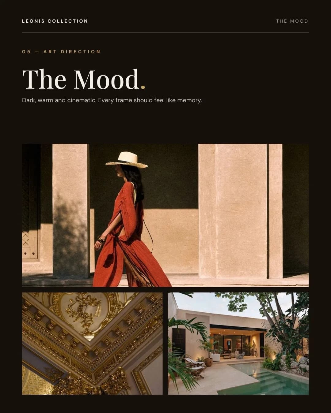
The photography is directed rather than taken. A page of reference frames fixes the hour, the warmth and the distance, so whoever chooses the next image chooses one that belongs.
IN USE
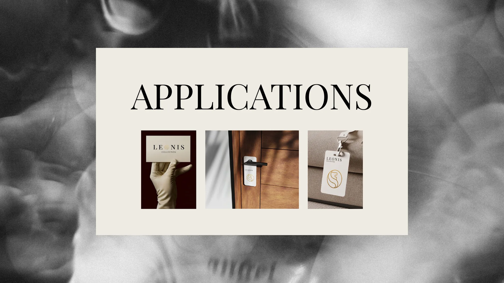
Three objects a guest would actually touch.
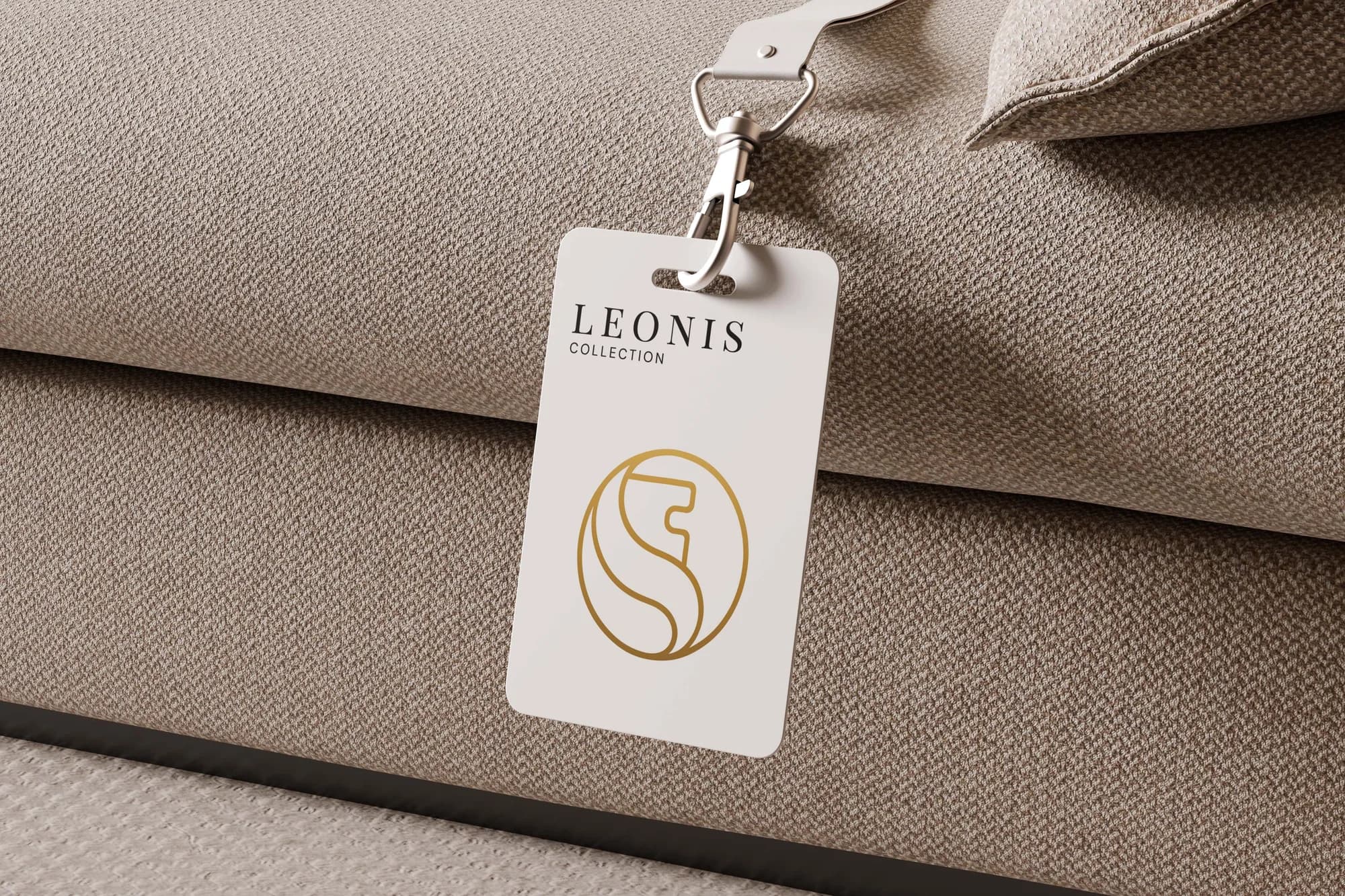
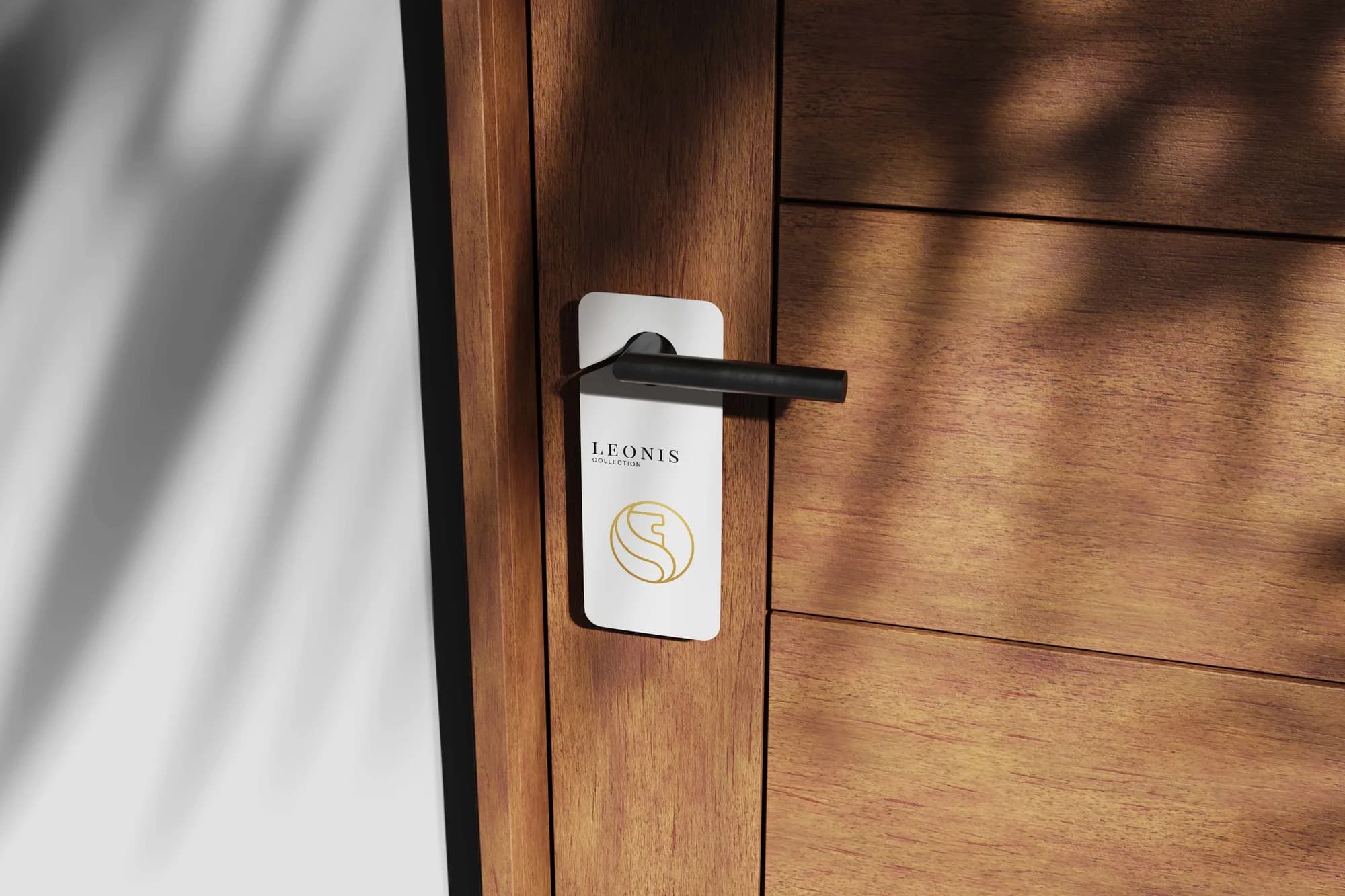
A luggage tag, a door hanger, a card. These are the pieces a guest meets before they meet anybody, which is why they were the three specified first.
All three in the same ivory and the same foil. The door hanger says nothing at all: by that point the mark on its own means do not disturb.
IN USE · THE ROLLOUT
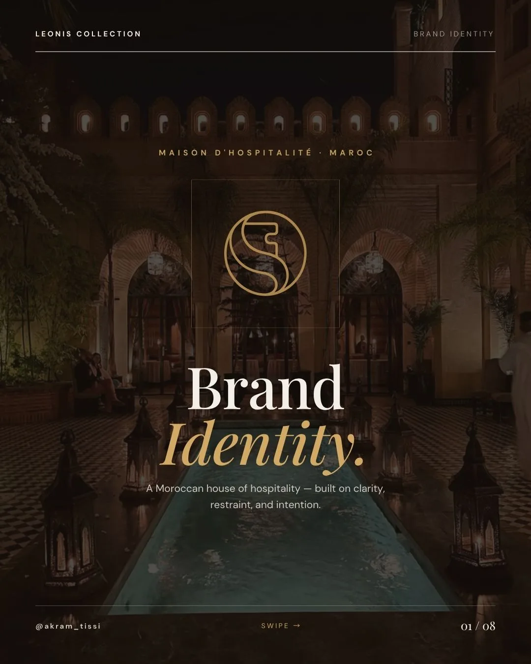
Eight slides for the people who never open a PDF.
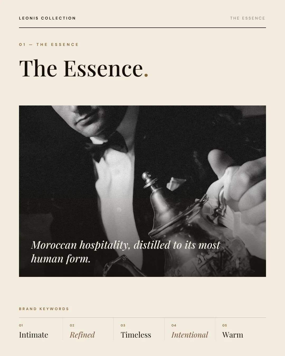
The identity, cut for the phone. Essence, symbol, palette, type, mood, applications: one idea a slide, in the order a stranger needs them.
It went out as a single pitch and came back signed off in one round.
Noor Studio