Posters.
A series arguing that good design outlives the decade that made it.
THE BRIEF
Editorial work with nobody to approve it, which is the only way to find out what you actually believe.
Designers argue about trends the way everybody else argues about the weather: constantly, and with no effect on it.
So I stopped writing the argument and set it instead. Each poster takes an era and makes the case in that era’s own dialect. If the reasoning still holds in a language that went out of fashion forty years ago, it was never about the style.
- ROLE
- Concept, writing & design
- ENGAGEMENT
- Self-initiated
Made tolast.
THE LEAD · MADE TO LAST
Three eras. Same argument. Three accents.
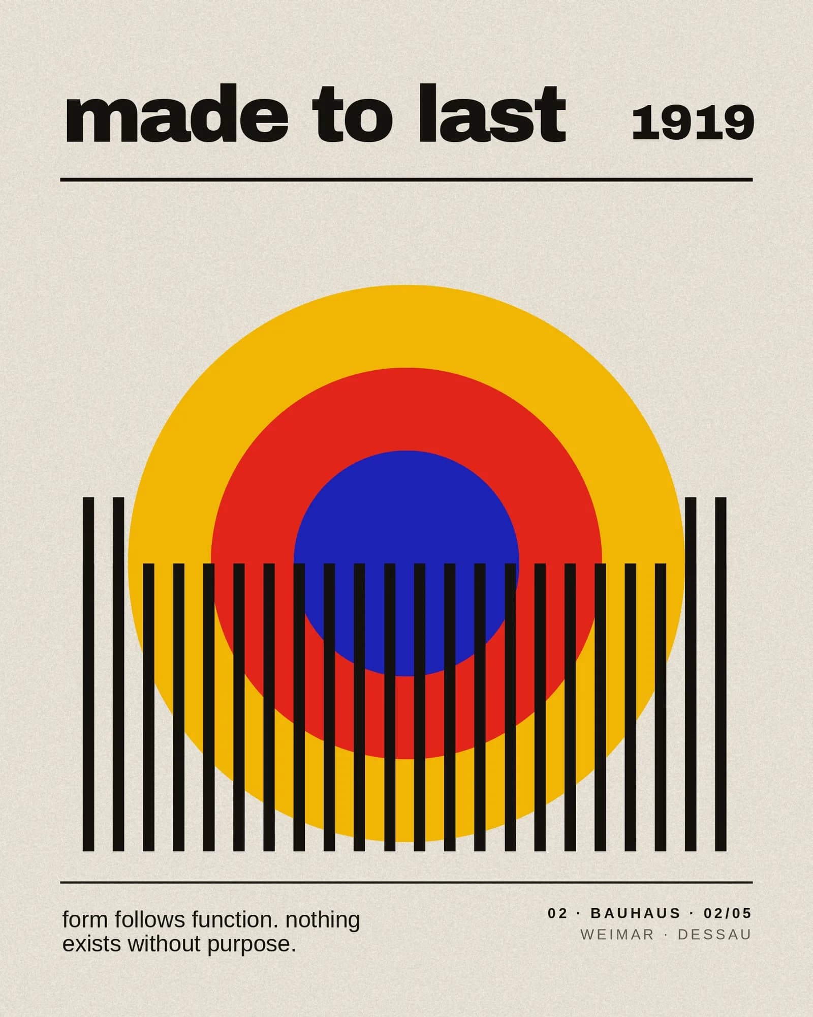
Bauhaus, 1919. Primary circles, a rule of bars, and the only sentence the school ever needed: form follows function, nothing exists without purpose. Set in the flat, patient geometry of Weimar.
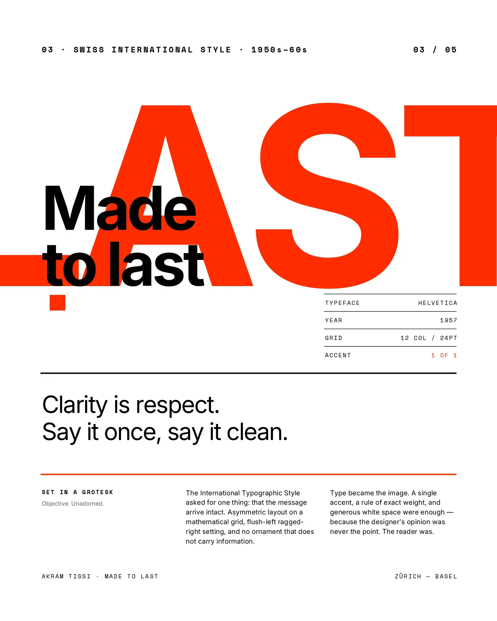
The International Style, 1957. Helvetica, a twelve-column grid, one accent used exactly once. Clarity is respect. The layout follows its own instruction: asymmetric, flush left, ragged right, and no ornament that is not carrying information.
Grunge, 1994. Photocopied halftones, tape, acid green, a cat. Rules are boring, break the frame on purpose. It is the only sheet in the set that argues by misbehaving, and the grid is still underneath it, which is the joke.

THE REST OF THE SET
Other arguments, other rooms.
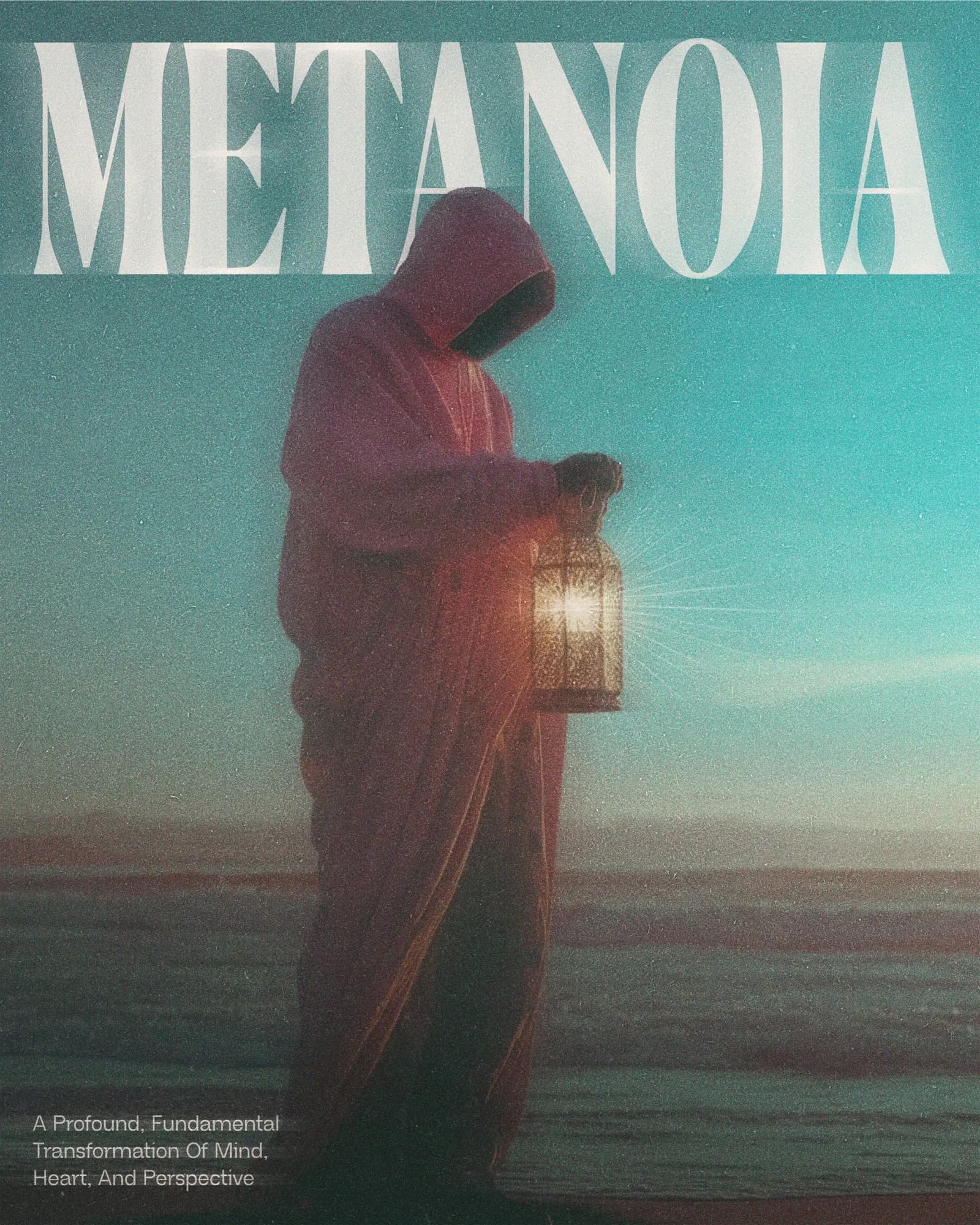
Metanoia. A figure, a lantern, and a word most people have to look up, which is exactly why it is eight inches high.
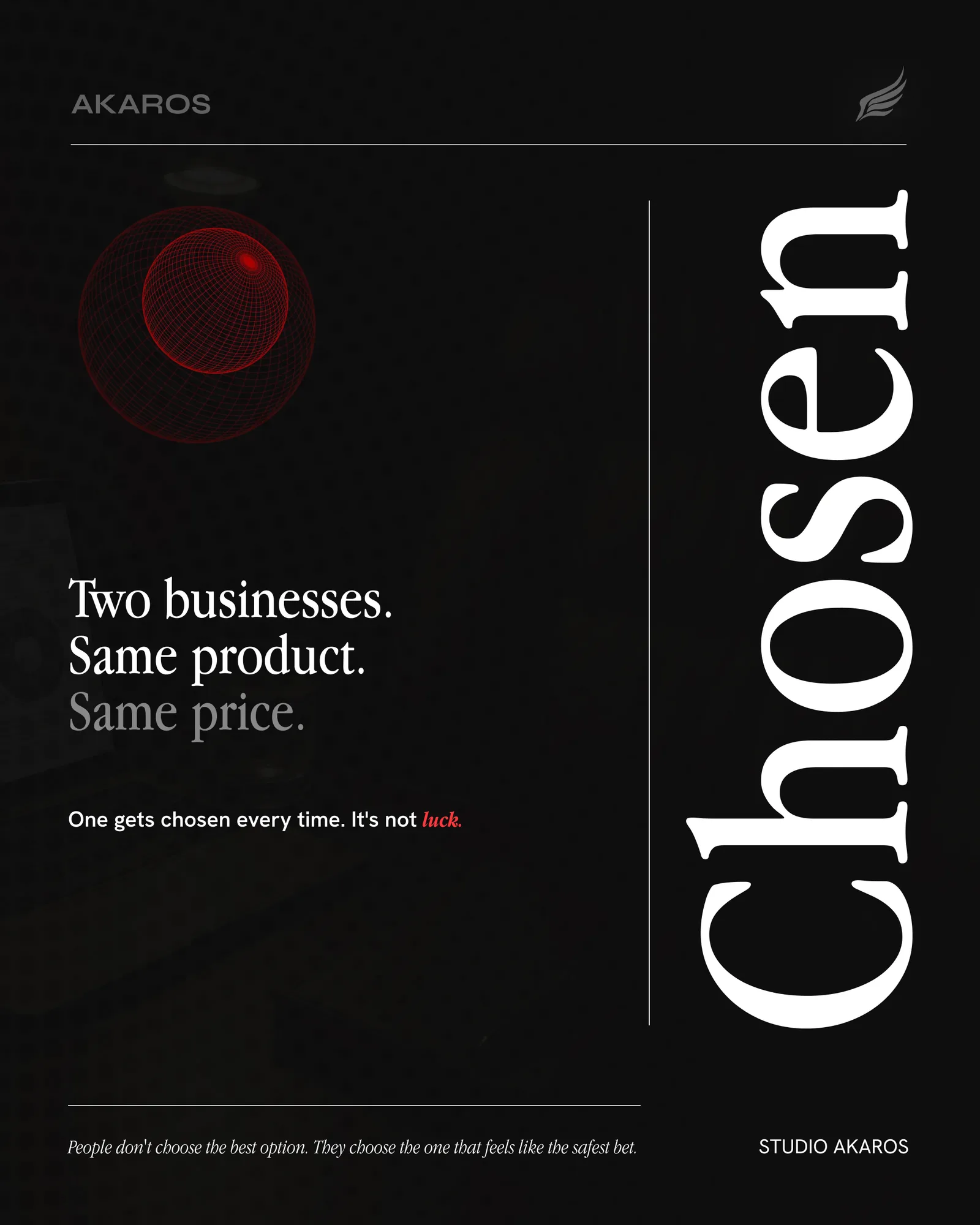
Akaros. Two businesses, same product, same price, and one of them gets chosen every time. Written as an ad, laid out as a statement.
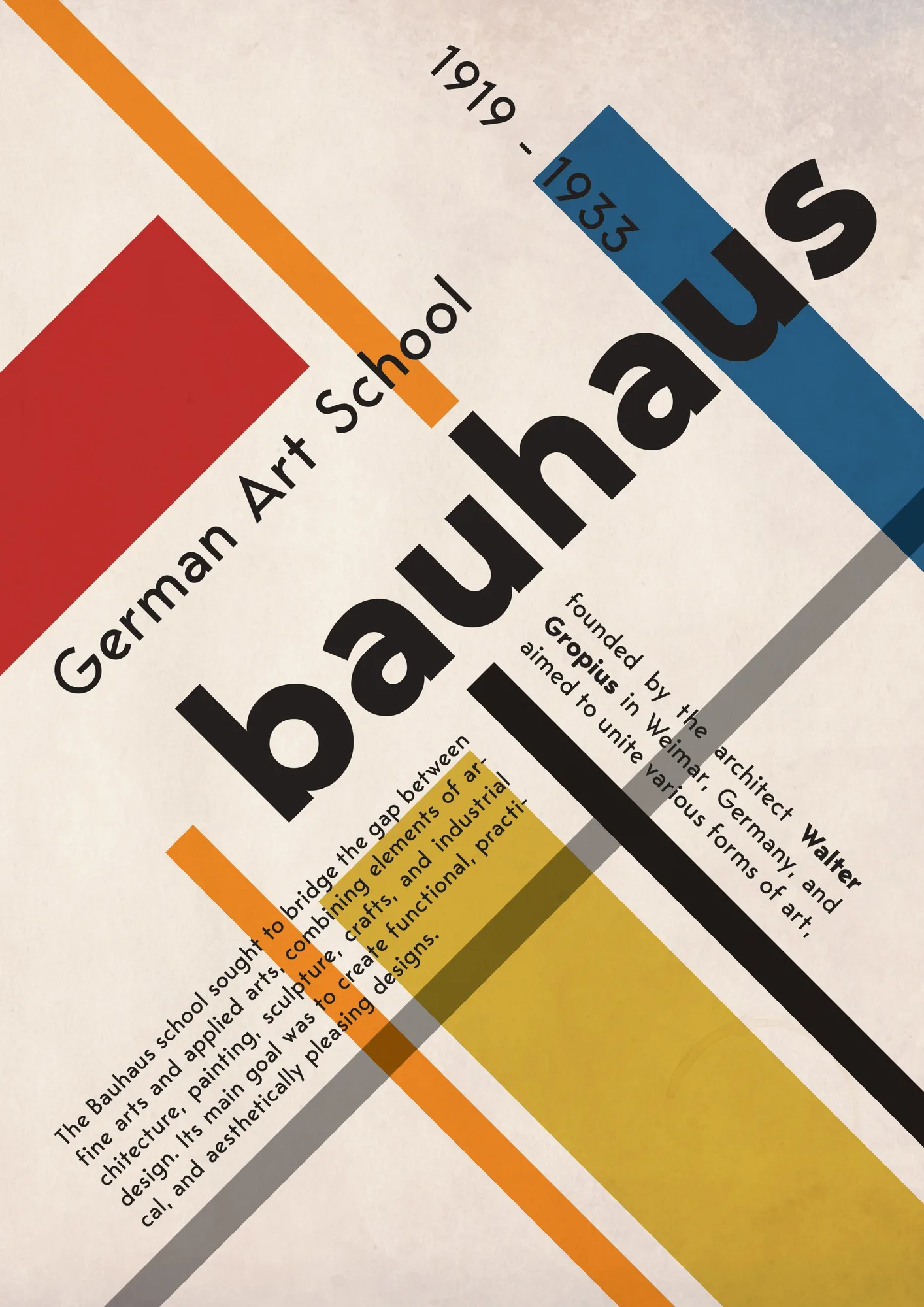
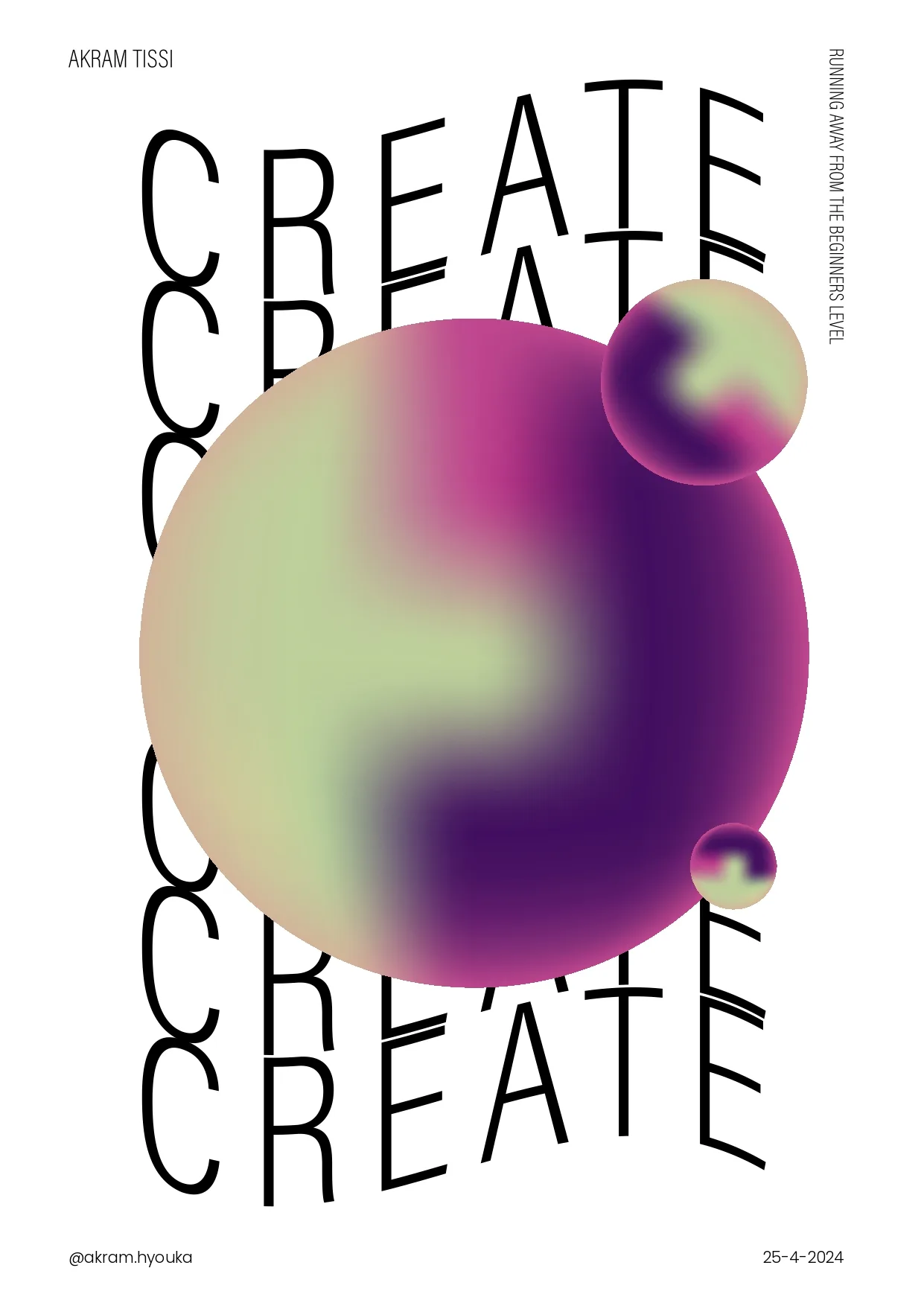
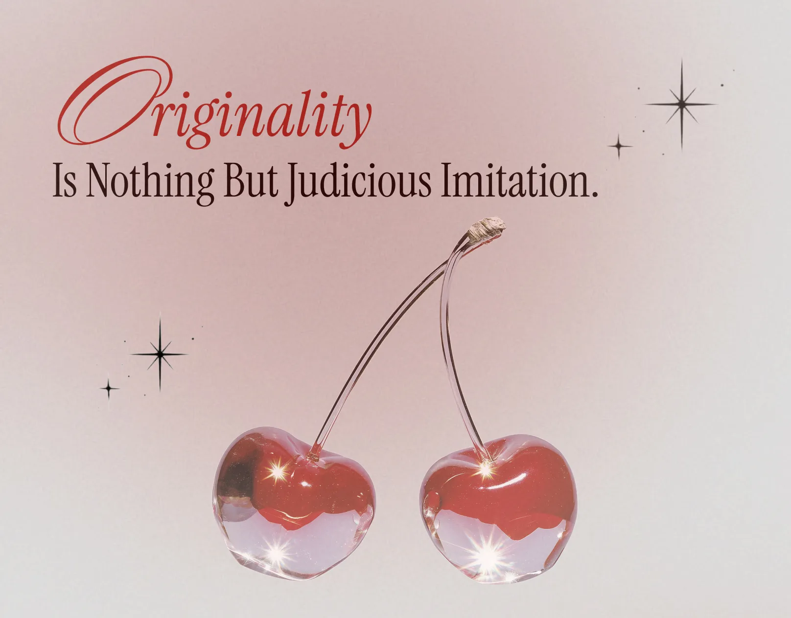
Then the studies: the Bauhaus school poster, a type experiment that lets CREATE fall out of frame, and a chrome still life for the line about originality being judicious imitation. Not every poster needs a client to be worth making.
Leonis Collection